在线商店中的因果归因和根本原因分析#
本笔记本是相应博客文章的扩展和更新版本:使用 DoWhy 进行根本原因分析,一个用于因果机器学习的开源 Python 库
在本示例中,我们将考察一家在线商店,分析不同因素如何影响我们的利润。特别地,我们想分析利润意外下降的原因,并找出潜在的根本原因。为此,我们可以利用图形因果模型(GCM)。
场景#
假设我们在一家在线商店销售一款零售价为 999 美元的智能手机。该产品的总利润取决于几个因素,例如销售数量、运营成本或广告支出。另一方面,例如,销售数量取决于产品页面的访问量、价格本身以及潜在的促销活动。假设我们观察到该产品在 2021 年利润稳定,但在 2022 年初利润突然大幅下降。为什么?
在以下场景中,我们将使用 DoWhy 更好地了解影响利润的因素的因果影响,并找出利润下降的原因。为了分析我们面临的问题,我们首先需要定义我们对因果关系的信念。为此,我们收集了影响利润的不同因素的每日记录。这些因素是
购物活动?:一个二元值,表示是否有特殊的购物活动发生,例如黑色星期五或网络星期一促销。
广告支出:广告活动的支出。
页面浏览量:产品详情页面的访问次数。
单价:设备的价格,可能因临时折扣而有所不同。
销售数量:售出手机的数量。
收入:每日收入。
运营成本:每日运营费用,包括生产成本、广告支出、管理费用等。
利润:每日利润。
查看这些属性,我们可以利用我们的领域知识以有向无环图的形式描述因果关系,这在下文中代表我们的因果图。该图如下所示
[1]:
from IPython.display import Image
Image('online-shop-graph.png')
[1]:
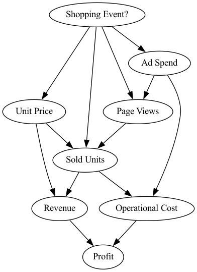
在这个场景中,我们知道以下几点
步骤 1:定义因果模型#
现在,让我们来建模这些因果关系。第一步,我们需要定义一个所谓的结构因果模型(SCM),它是因果图和描述数据生成过程的底层生成模型的组合。
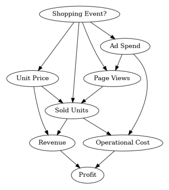
因果图可以通过以下方式定义
[2]:
import networkx as nx

causal_graph = nx.DiGraph([('Page Views', 'Sold Units'),
                           ('Revenue', 'Profit'),
                           ('Unit Price', 'Sold Units'),
                           ('Unit Price', 'Revenue'),
                           ('Shopping Event?', 'Page Views'),
                           ('Shopping Event?', 'Sold Units'),
                           ('Shopping Event?', 'Unit Price'),
                           ('Shopping Event?', 'Ad Spend'),
                           ('Ad Spend', 'Page Views'),
                           ('Ad Spend', 'Operational Cost'),
                           ('Sold Units', 'Revenue'),
                           ('Sold Units', 'Operational Cost'),
                           ('Operational Cost', 'Profit')])
为了验证我们没有遗漏任何边,我们可以绘制此图
[3]:
from dowhy.utils import plot

plot(causal_graph)
接下来,我们看看 2021 年的数据
[4]:
import pandas as pd
import numpy as np

pd.options.display.float_format = '${:,.2f}'.format  # Format dollar columns

data_2021 = pd.read_csv('2021 Data.csv', index_col='Date')
data_2021.head()
[4]:
| 购物活动? | 广告支出 | 页面浏览量 | 单价 | 销售数量 | 收入 | 运营成本 | 利润 | |
|---|---|---|---|---|---|---|---|---|
| 日期 | ||||||||
| 2021-01-01 | False | $1,490.49 | 11861 | $999.00 | 2317 | $2,314,683.00 | $1,659,999.89 | $654,683.11 |
| 2021-01-02 | False | $1,455.92 | 11776 | $999.00 | 2355 | $2,352,645.00 | $1,678,959.08 | $673,685.92 |
| 2021-01-03 | False | $1,405.82 | 11861 | $999.00 | 2391 | $2,388,609.00 | $1,696,906.14 | $691,702.86 |
| 2021-01-04 | False | $1,379.30 | 11677 | $999.00 | 2344 | $2,341,656.00 | $1,673,380.64 | $668,275.36 |
| 2021-01-05 | False | $1,234.20 | 11871 | $999.00 | 2412 | $2,409,588.00 | $1,707,252.61 | $702,335.39 |
正如我们所见,我们在 2021 年的每一天都有一个样本,其中包含因果图中的所有变量。请注意,在我们此处考虑的合成数据中,购物活动也是随机生成的。
我们定义了因果图,但我们仍然需要为节点分配生成模型。我们可以手动指定这些模型,并在需要时配置它们,或者使用数据启发式方法自动推断“适当”的模型。我们这里将利用后者。
[5]:
from dowhy import gcm
gcm.util.general.set_random_seed(0)

# Create the structural causal model object
scm = gcm.StructuralCausalModel(causal_graph)

# Automatically assign generative models to each node based on the given data
auto_assignment_summary = gcm.auto.assign_causal_mechanisms(scm, data_2021)
在可能的情况下,我们建议根据先验知识分配模型,因为这样模型将更接近地模拟领域物理,而不是依赖于数据的细微差别。然而,这里我们请 DoWhy 代劳了。
自动分配模型后,我们可以打印摘要以了解所选模型的一些信息
[6]:
print(auto_assignment_summary)
When using this auto assignment function, the given data is used to automatically assign a causal mechanism to each node. Note that causal mechanisms can also be customized and assigned manually.
The following types of causal mechanisms are considered for the automatic selection:

If root node:
An empirical distribution, i.e., the distribution is represented by randomly sampling from the provided data. This provides a flexible and non-parametric way to model the marginal distribution and is valid for all types of data modalities.

If non-root node and the data is continuous:
Additive Noise Models (ANM) of the form X_i = f(PA_i) + N_i, where PA_i are the parents of X_i and the unobserved noise N_i is assumed to be independent of PA_i.To select the best model for f, different regression models are evaluated and the model with the smallest mean squared error is selected.Note that minimizing the mean squared error here is equivalent to selecting the best choice of an ANM.

If non-root node and the data is discrete:
Discrete Additive Noise Models have almost the same definition as non-discrete ANMs, but come with an additional constraint for f to only return discrete values.
Note that 'discrete' here refers to numerical values with an order. If the data is categorical, consider representing them as strings to ensure proper model selection.

If non-root node and the data is categorical:
A functional causal model based on a classifier, i.e., X_i = f(PA_i, N_i).
Here, N_i follows a uniform distribution on [0, 1] and is used to randomly sample a class (category) using the conditional probability distribution produced by a classification model.Here, different model classes are evaluated using the (negative) F1 score and the best performing model class is selected.

In total, 8 nodes were analyzed:

--- Node: Shopping Event?
Node Shopping Event? is a root node. Therefore, assigning 'Empirical Distribution' to the node representing the marginal distribution.

--- Node: Unit Price
Node Unit Price is a non-root node with continuous data. Assigning 'AdditiveNoiseModel using LinearRegression' to the node.
This represents the causal relationship as Unit Price := f(Shopping Event?) + N.
For the model selection, the following models were evaluated on the mean squared error (MSE) metric:
LinearRegression: 142.77431246551515
Pipeline(steps=[('polynomialfeatures', PolynomialFeatures(include_bias=False)),
                ('linearregression', LinearRegression)]): 142.78271703597315
HistGradientBoostingRegressor: 439.63843778273156

--- Node: Ad Spend
Node Ad Spend is a non-root node with continuous data. Assigning 'AdditiveNoiseModel using LinearRegression' to the node.
This represents the causal relationship as Ad Spend := f(Shopping Event?) + N.
For the model selection, the following models were evaluated on the mean squared error (MSE) metric:
LinearRegression: 15950.378625434218
Pipeline(steps=[('polynomialfeatures', PolynomialFeatures(include_bias=False)),
                ('linearregression', LinearRegression)]): 16057.728423653647
HistGradientBoostingRegressor: 80313.4296584338

--- Node: Page Views
Node Page Views is a non-root node with discrete data. Assigning 'Discrete AdditiveNoiseModel using Pipeline' to the node.
This represents the discrete causal relationship as Page Views := f(Ad Spend,Shopping Event?) + N.
For the model selection, the following models were evaluated on the mean squared error (MSE) metric:
Pipeline(steps=[('polynomialfeatures', PolynomialFeatures(include_bias=False)),
                ('linearregression', LinearRegression)]): 83938.3537814653
LinearRegression: 85830.1184468119
HistGradientBoostingRegressor: 1428896.628193814

--- Node: Sold Units
Node Sold Units is a non-root node with discrete data. Assigning 'Discrete AdditiveNoiseModel using LinearRegression' to the node.
This represents the discrete causal relationship as Sold Units := f(Page Views,Shopping Event?,Unit Price) + N.
For the model selection, the following models were evaluated on the mean squared error (MSE) metric:
LinearRegression: 8904.890796950855
Pipeline(steps=[('polynomialfeatures', PolynomialFeatures(include_bias=False)),
                ('linearregression', LinearRegression)]): 14157.831817904153
HistGradientBoostingRegressor: 231668.29855446037

--- Node: Revenue
Node Revenue is a non-root node with continuous data. Assigning 'AdditiveNoiseModel using Pipeline' to the node.
This represents the causal relationship as Revenue := f(Sold Units,Unit Price) + N.
For the model selection, the following models were evaluated on the mean squared error (MSE) metric:
Pipeline(steps=[('polynomialfeatures', PolynomialFeatures(include_bias=False)),
                ('linearregression', LinearRegression)]): 1.0800435888102176e-18
LinearRegression: 69548987.23197266
HistGradientBoostingRegressor: 155521789447.02286

--- Node: Operational Cost
Node Operational Cost is a non-root node with continuous data. Assigning 'AdditiveNoiseModel using LinearRegression' to the node.
This represents the causal relationship as Operational Cost := f(Ad Spend,Sold Units) + N.
For the model selection, the following models were evaluated on the mean squared error (MSE) metric:
LinearRegression: 38.71409364534825
Pipeline(steps=[('polynomialfeatures', PolynomialFeatures(include_bias=False)),
                ('linearregression', LinearRegression)]): 39.01584891167706
HistGradientBoostingRegressor: 18332123695.022976

--- Node: Profit
Node Profit is a non-root node with continuous data. Assigning 'AdditiveNoiseModel using LinearRegression' to the node.
This represents the causal relationship as Profit := f(Operational Cost,Revenue) + N.
For the model selection, the following models were evaluated on the mean squared error (MSE) metric:
LinearRegression: 1.852351985649207e-18
Pipeline(steps=[('polynomialfeatures', PolynomialFeatures(include_bias=False)),
                ('linearregression', LinearRegression)]): 2.8418485593830953e-06
HistGradientBoostingRegressor: 22492460598.32865

===Note===
Note, based on the selected auto assignment quality, the set of evaluated models changes.
For more insights toward the quality of the fitted graphical causal model, consider using the evaluate_causal_model function after fitting the causal mechanisms.
正如我们所见,虽然自动分配也考虑了非线性模型,但线性模型足以描述大多数关系,除了收入,它是销售数量和单价的乘积。
步骤 2:将因果模型与数据拟合#
为每个节点分配模型后,我们需要学习模型的参数
[7]:
gcm.fit(scm, data_2021)
Fitting causal mechanism of node Operational Cost: 100%|██████████| 8/8 [00:00<00:00, 365.79it/s]
fit 方法学习每个节点中生成模型的参数。在我们继续之前,让我们快速了解一下因果机制的性能以及它们如何很好地捕捉分布。
[8]:
print(gcm.evaluate_causal_model(scm, data_2021, compare_mechanism_baselines=True, evaluate_invertibility_assumptions=False, evaluate_causal_structure=False))
Evaluating causal mechanisms...: 100%|██████████| 8/8 [00:00<00:00, 882.76it/s]
Evaluated the performance of the causal mechanisms and the overall average KL divergence between generated and observed distribution. The results are as follows:

==== Evaluation of Causal Mechanisms ====
The used evaluation metrics are:
- KL divergence (only for root-nodes): Evaluates the divergence between the generated and the observed distribution.
- Mean Squared Error (MSE): Evaluates the average squared differences between the observed values and the conditional expectation of the causal mechanisms.
- Normalized MSE (NMSE): The MSE normalized by the standard deviation for better comparison.
- R2 coefficient: Indicates how much variance is explained by the conditional expectations of the mechanisms. Note, however, that this can be misleading for nonlinear relationships.
- F1 score (only for categorical non-root nodes): The harmonic mean of the precision and recall indicating the goodness of the underlying classifier model.
- (normalized) Continuous Ranked Probability Score (CRPS): The CRPS generalizes the Mean Absolute Percentage Error to probabilistic predictions. This gives insights into the accuracy and calibration of the causal mechanisms.
NOTE: Every metric focuses on different aspects and they might not consistently indicate a good or bad performance.
We will mostly utilize the CRPS for comparing and interpreting the performance of the mechanisms, since this captures the most important properties for the causal model.

--- Node Shopping Event?
- The KL divergence between generated and observed distribution is 0.019221919686426836.
The estimated KL divergence indicates an overall very good representation of the data distribution.

--- Node Unit Price
- The MSE is 156.48090806251736.
- The NMSE is 0.6938977880013996.
- The R2 coefficient is 0.35194776992616694.
- The normalized CRPS is 0.12553014444452665.
The estimated CRPS indicates a very good model performance.
The mechanism is better or equally good than all 7 baseline mechanisms.

--- Node Ad Spend
- The MSE is 16677.202023167338.
- The NMSE is 0.48344956888514795.
- The R2 coefficient is 0.7512082042758019.
- The normalized CRPS is 0.2720127266162416.
The estimated CRPS indicates a good model performance.
The mechanism is better or equally good than all 7 baseline mechanisms.

--- Node Page Views
- The MSE is 77900.05479452056.
- The NMSE is 0.3462130891886136.
- The R2 coefficient is 0.7335844848896803.
- The normalized CRPS is 0.1803592381314227.
The estimated CRPS indicates a very good model performance.
The mechanism is better or equally good than all 7 baseline mechanisms.

--- Node Sold Units
- The MSE is 8758.161643835618.
- The NMSE is 0.1340557695877285.
- The R2 coefficient is 0.981600440084566.
- The normalized CRPS is 0.056745468190872575.
The estimated CRPS indicates a very good model performance.
The mechanism is better or equally good than all 7 baseline mechanisms.

--- Node Revenue
- The MSE is 1.7763093127296757e-19.
- The NMSE is 6.786229331465976e-16.
- The R2 coefficient is 1.0.
- The normalized CRPS is 1.4574679362932044e-16.
The estimated CRPS indicates a very good model performance.
The mechanism is better or equally good than all 7 baseline mechanisms.

--- Node Operational Cost
- The MSE is 38.48242630536858.
- The NMSE is 1.820517232232272e-05.
- The R2 coefficient is 0.9999999996455899.
- The normalized CRPS is 1.001979239428077e-05.
The estimated CRPS indicates a very good model performance.
The mechanism is better or equally good than all 7 baseline mechanisms.

--- Node Profit
- The MSE is 1.5832322135199285e-18.
- The NMSE is 4.723810955181931e-15.
- The R2 coefficient is 1.0.
- The normalized CRPS is 3.157782102773924e-16.
The estimated CRPS indicates a very good model performance.
The mechanism is better or equally good than all 7 baseline mechanisms.

==== Evaluation of Generated Distribution ====
The overall average KL divergence between the generated and observed distribution is 1.0102049246719438
The estimated KL divergence indicates some mismatches between the distributions.

==== NOTE ====
Always double check the made model assumptions with respect to the graph structure and choice of causal mechanisms.
All these evaluations give some insight into the goodness of the causal model, but should not be overinterpreted, since some causal relationships can be intrinsically hard to model. Furthermore, many algorithms are fairly robust against misspecifications or poor performances of causal mechanisms.
拟合的因果机制很好地表示了数据生成过程,只存在一些微小的误差。然而,考虑到样本量小以及许多节点的信噪比较低,这是意料之中的。最重要的是,所有基准机制都没有表现得更好,这很好地表明我们的模型选择是合适的。根据评估,我们也不拒绝给定的因果图。
也可以配置基准模型的选择。有关更多详细信息,请参阅相应的 evaluate_causal_model 文档。
步骤 3:回答因果问题#
生成新样本#
由于我们了解了数据生成过程,我们也可以生成新的样本
[9]:
gcm.draw_samples(scm, num_samples=10)
[9]:
| 购物活动? | 单价 | 广告支出 | 页面浏览量 | 销售数量 | 收入 | 运营成本 | 利润 | |
|---|---|---|---|---|---|---|---|---|
| 0 | False | $999.00 | $1,226.62 | 11761 | 2355 | $2,352,645.00 | $1,678,734.40 | $673,910.60 |
| 1 | False | $999.00 | $1,452.27 | 11680 | 2309 | $2,306,691.00 | $1,655,963.89 | $650,727.11 |
| 2 | False | $999.00 | $1,258.09 | 11849 | 2357 | $2,354,643.00 | $1,679,769.27 | $674,873.73 |
| 3 | False | $999.00 | $1,392.70 | 11637 | 2335 | $2,332,665.00 | $1,668,898.80 | $663,766.20 |
| 4 | False | $999.00 | $1,217.63 | 11713 | 2311 | $2,308,689.00 | $1,656,722.94 | $651,966.06 |
| 5 | False | $999.00 | $1,100.55 | 11720 | 2333 | $2,330,667.00 | $1,667,603.33 | $663,063.67 |
| 6 | False | $989.76 | $1,240.77 | 11710 | 2394 | $2,369,495.96 | $1,698,243.13 | $671,252.83 |
| 7 | False | $999.00 | $1,173.21 | 11444 | 2709 | $2,706,291.00 | $1,855,673.43 | $850,617.57 |
| 8 | False | $999.00 | $1,326.60 | 11658 | 2350 | $2,347,650.00 | $1,676,334.74 | $671,315.26 |
| 9 | False | $999.00 | $1,409.23 | 11845 | 2372 | $2,369,628.00 | $1,687,412.42 | $682,215.58 |
我们根据学习到的因果关系从联合分布中抽取了 10 个样本。
影响利润方差的关键因素是什么?#
在这一点上,我们想了解哪些因素导致利润发生变化。让我们先仔细看看利润随时间的变化。为此,我们绘制了 2021 年的利润随时间变化的图,生成的图表显示了 Y 轴上的美元利润和 X 轴上的时间。
[10]:
data_2021['Profit'].plot(ylabel='Profit in $', figsize=(15,5), rot=45)
[10]:
<Axes: xlabel='Date', ylabel='Profit in $'>
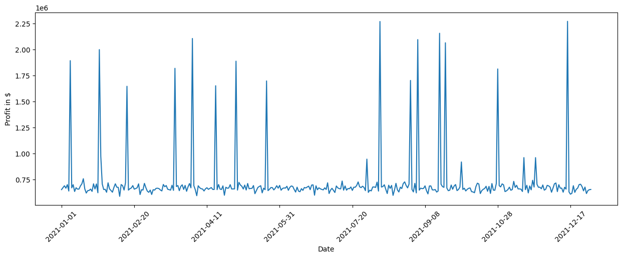
我们看到全年利润出现了一些显著的峰值。我们可以通过查看标准差进一步量化这一点
[11]:
data_2021['Profit'].std()
[11]:
估计的标准差约为 259247 美元,这是相当显著的。查看因果图,我们看到收入和运营成本对利润有直接影响,但其中哪个对利润的方差贡献最大?为了弄清楚这一点,我们可以利用直接箭头强度算法,该算法量化图中特定箭头的因果影响。
[12]:
import numpy as np

# Note: The percentage conversion only makes sense for purely positive attributions.
def convert_to_percentage(value_dictionary):
    total_absolute_sum = np.sum([abs(v) for v in value_dictionary.values()])
    return {k: abs(v) / total_absolute_sum * 100 for k, v in value_dictionary.items()}


arrow_strengths = gcm.arrow_strength(scm, target_node='Profit')

plot(causal_graph,
     causal_strengths=convert_to_percentage(arrow_strengths),
     figure_size=[15, 10])
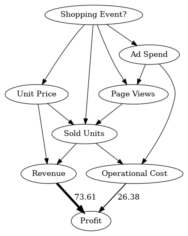
在这个因果图中,我们看到每个节点对利润方差的贡献程度。为简单起见,贡献被转换为百分比。由于利润本身只是收入和运营成本之间的差额,我们不期望有其他因素影响方差。正如我们所见,收入比运营成本影响更大。这很有道理,因为收入通常比运营成本变化更大,这归因于其对销售数量的更强依赖性。请注意,直接箭头强度方法也支持使用其他类型的度量,例如 KL 散度。
虽然直接影响有助于理解哪些直接父节点对利润方差影响最大,但这主要证实了我们先前的信念。然而,最终哪个因素导致了这种高方差的问题仍然不清楚。例如,收入本身基于销售数量和单价。尽管我们可以递归地将直接箭头强度应用于所有节点,但我们无法获得关于上游节点对方差影响的正确加权洞察。
对利润方差做出贡献的重要因果因素是什么?为了找出答案,我们可以使用内在因果贡献方法,该方法通过仅考虑由节点新添加而不是仅从其父节点继承的信息,将利润的方差归因于因果图中的上游节点。例如,一个仅仅是其父节点缩放版本的节点将没有任何内在贡献。有关更多详细信息,请参阅相应的研究论文。
让我们将该方法应用于数据
[13]:
iccs = gcm.intrinsic_causal_influence(scm, target_node='Profit', num_samples_randomization=500)
Evaluating set functions...: 100%|██████████| 120/120 [02:37<00:00, 1.31s/it]
[14]:
from dowhy.utils import bar_plot

bar_plot(convert_to_percentage(iccs), ylabel='Variance attribution in %')
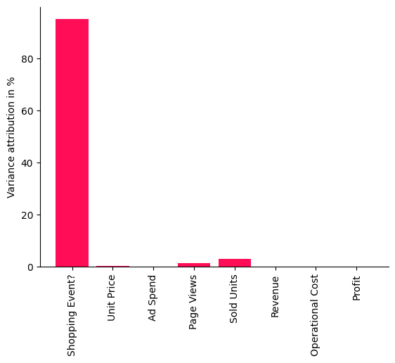
此条形图中显示的分数表示每个节点对利润方差的贡献百分比——不继承其父节点在因果图中的方差。正如我们清晰地看到,购物活动对我们的利润方差影响最大。这很有道理,因为在黑色星期五或 Prime Day 等促销期间,销售受到严重影响,从而影响总体利润。令人惊讶的是,我们还看到销售数量或页面浏览量等因素影响相当小,也就是说,利润的大方差几乎完全可以通过购物活动来解释。让我们通过标记发生购物活动的日子来直观地检查这一点。为此,我们再次使用 pandas plot 函数,此外,在图表中用红色垂直条标记发生购物活动的所有点。
[15]:
import matplotlib.pyplot as plt

data_2021['Profit'].plot(ylabel='Profit in $', figsize=(15,5), rot=45)
plt.vlines(np.arange(0, data_2021.shape[0])[data_2021['Shopping Event?']], data_2021['Profit'].min(), data_2021['Profit'].max(), linewidth=10, alpha=0.3, color='r')
[15]:
<matplotlib.collections.LineCollection at 0x7ff10016d460>
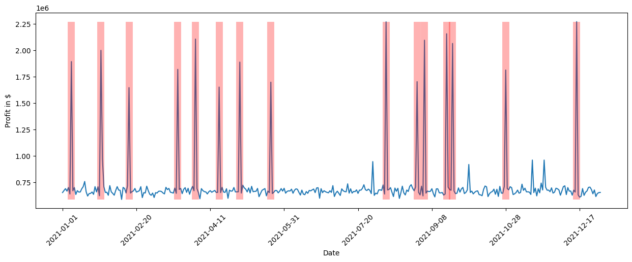
我们清楚地看到,购物活动与利润的高峰期同时发生。虽然我们可以通过查看各种不同的关系或使用领域知识来手动调查这一点,但随着系统复杂性的增加,任务会变得更加困难。通过几行代码,我们从 DoWhy 中获得了这些洞察。
解释特定日期利润下降的关键因素是什么?#
经过成功的一年(就利润而言),新技术进入市场,因此我们希望保持利润增长并通过销售更多设备来清理过剩库存。为了增加需求,我们在 2022 年初将零售价降低了 10%。根据之前的分析,我们知道价格降低 10% 将使需求大致增加 13.75%,略有盈余。根据需求价格弹性模型,我们预计销售数量将增加约 37.5%。让我们加载 2022 年第一天的数据,并计算该天两年销售数量之比,看看是否如此
[16]:
first_day_2022 = pd.read_csv('2022 First Day.csv', index_col='Date')
(first_day_2022['Sold Units'][0] / data_2021['Sold Units'][0] - 1) * 100
[16]:
令人惊讶的是,我们仅将销售数量增加了约 19%。考虑到收入远低于预期,这无疑会影响利润。让我们与去年同一时间进行比较
[17]:
(1 - first_day_2022['Profit'][0] / data_2021['Profit'][0]) * 100
[17]:
确实,利润下降了约 8.5%。鉴于我们预期由于价格下降会带来更高的需求,为什么会这样呢?让我们调查一下这里发生了什么。
为了找出导致利润下降的原因,我们可以利用 DoWhy 的异常归因功能。在这里,我们只需指定我们感兴趣的目标节点(利润)和我们想要分析的异常样本(2022 年的第一天)。然后将这些结果绘制在条形图中,显示给定异常样本下每个节点的归因分数。
[18]:
attributions = gcm.attribute_anomalies(scm, target_node='Profit', anomaly_samples=first_day_2022)

bar_plot({k: v[0] for k, v in attributions.items()}, ylabel='Anomaly attribution score')
Evaluating set functions...: 100%|██████████| 125/125 [00:03<00:00, 38.58it/s]
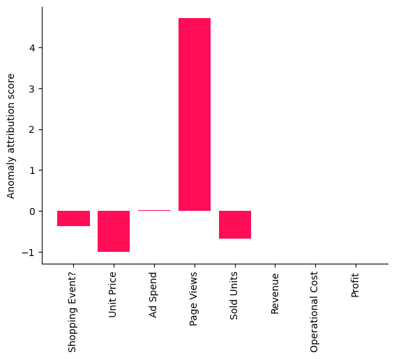
正的归因分数意味着相应的节点对观察到的异常做出了贡献,在我们这里,异常就是利润下降。节点的负分数表明观察到的节点值实际上正在降低异常发生的可能性(例如,由于价格下降导致的需求增加应该会增加利润)。有关分数解释的更多详细信息可以在相应的研究论文中找到。有趣的是,页面浏览量作为解释当天利润下降的一个因素格外突出,如此处所示的条形图所示。
虽然此方法为我们学习到的特定模型和参数提供了归因的点估计,但我们也可以使用 DoWhy 的置信区间功能,该功能包含关于拟合模型参数和算法近似的 K 不确定性。
[19]:
gcm.config.disable_progress_bars()  # We turn off the progress bars here to reduce the number of outputs.

median_attributions, confidence_intervals, = gcm.confidence_intervals(
    gcm.fit_and_compute(gcm.attribute_anomalies,
                        scm,
                        bootstrap_training_data=data_2021,
                        target_node='Profit',
                        anomaly_samples=first_day_2022),
    num_bootstrap_resamples=10)
[20]:
bar_plot(median_attributions, confidence_intervals, 'Anomaly attribution score')
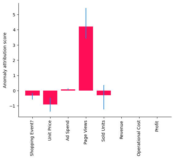
注意,在此条形图中,我们看到在较小数据集上多次运行的中位数归因,其中每次运行都会重新拟合模型并重新评估归因。我们得到了与之前相似的图景,但销售数量归因的置信区间也包含零,这意味着其贡献微不足道。但一些重要问题仍然存在:这仅仅是巧合吗?如果不是,我们系统中的哪一部分发生了变化?为了弄清楚这一点,我们需要收集更多数据。
请注意,结果因所选数据而异,因为它们是样本特定的。在其他日子,其他因素可能相关。此外,请注意,分析(包括置信区间)始终依赖于所做的建模假设。换句话说,如果模型发生变化或拟合效果差,也会得到不同的结果。
2022 年第一季度利润下降的原因是什么?#
虽然先前的分析基于单一观测,但让我们看看这是否仅仅是巧合,还是一个持续存在的问题。在准备季度业务报告时,我们有更多来自前三个月的数据。我们首先检查 2022 年第一季度的平均利润与 2021 年相比是否下降。与之前类似,我们可以通过计算 2022 年和 2021 年第一季度平均利润之比来做到这一点。
[21]:
data_first_quarter_2021 = data_2021[data_2021.index <= '2021-03-31']
data_first_quarter_2022 = pd.read_csv("2022 First Quarter.csv", index_col='Date')

(1 - data_first_quarter_2022['Profit'].mean() / data_first_quarter_2021['Profit'].mean()) * 100
[21]:
确实,利润下降在 2022 年第一季度持续存在。那么,这根本原因是什么?让我们应用分布变化方法来识别系统中已发生变化的部分。
[22]:
median_attributions, confidence_intervals = gcm.confidence_intervals(
    lambda: gcm.distribution_change(scm,
                                    data_first_quarter_2021,
                                    data_first_quarter_2022,
                                    target_node='Profit',
                                    # Here, we are intersted in explaining the differences in the mean.
                                    difference_estimation_func=lambda x, y: np.mean(y) - np.mean(x))
)
[23]:
bar_plot(median_attributions, confidence_intervals, 'Profit change attribution in $')
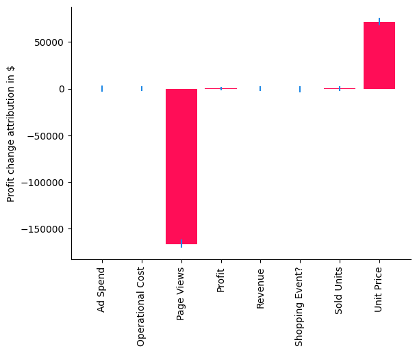
在我们的案例中,分布变化方法解释了利润均值的变化,即负值表示节点导致均值下降,正值表示均值增加。使用条形图,我们现在非常清楚地看到,单价的变化实际上对预期利润有轻微的正向贡献,这归因于销售数量的增加,但问题似乎来自页面浏览量,其值为负。虽然我们已经将此理解为 2022 年初利润下降的主要驱动因素,但我们现在已经分离并确认页面浏览量也发生了变化。让我们比较一下平均页面浏览量与上一年。
[24]:
(1 - data_first_quarter_2022['Page Views'].mean() / data_first_quarter_2021['Page Views'].mean()) * 100
[24]:
确实,页面浏览量下降了约 14%。由于我们已经排除了所有其他潜在因素,我们现在可以更深入地研究页面浏览量,看看那里发生了什么。这是一个假设情景,但我们可以想象这可能是由于搜索算法的变化,导致该产品在搜索结果中排名较低,从而将更少的客户引向产品页面。知道了这一点,我们现在就可以开始解决这个问题了。
数据生成过程#
虽然无法完全复现相同的数据,但以下数据集生成器应能提供非常相似类型的数据,并具有各种可调整参数。
[25]:
from dowhy.datasets import sales_dataset

data_2021 = sales_dataset(start_date="2021-01-01", end_date="2021-12-31")
data_2022 = sales_dataset(start_date="2022-01-01", end_date="2022-12-31", change_of_price=0.9)